Dear friends,
When working with color, the goal of the artist or designer is to create color harmony.
Color harmony- this is the consistency of colors among themselves as a result of the found proportionality of their areas and shapes, balance and consonance, based on finding a unique shade of each color. This harmony should evoke certain positive feelings and sensations in a person.
According to the nature of psychophysiological perception, it is customary to subdivide harmonic combinations into five color groups: monochromatic harmonious combinations of colors, harmonious combinations of related colors, harmonious combinations of contrasting colors, harmonious combinations of related-contrasting colors and harmonic combinations “Triad”.
- Monochrome harmonic combinations built on the basis of one color. They are created by combining a chosen color with its light and dark shades, obtained by adding white and black. As a result, you can achieve, on the one hand, a strong tonal contrast, and on the other, subtle color relationships. The overall color tone gives monochromatic combinations a calm, balanced character.
Monochrome harmony
Depending on the tasks, color harmony can be organized in different lightness ranges. For example, using the full light range expresses peace and stability. The selection of colors separated from each other by different intervals contributes to the manifestation of activity and color intensity. To express dynamic contrast, choose two colors with a small tonal interval between them and a third with a larger interval. A uniform ratio of areas occupied in combined colors affirms statics, while an uneven ratio asserts dynamics.

Monochrome harmony in nature
- Harmonic combinations of related colors achieved by using three colors that are adjacent to each other on the color wheel. Due to their proximity, these colors are easy to combine. This harmony can have a lot of depth, it is characterized by rich originality and an elegant appearance. The harmony of related colors is based on the similarity of color tones (or on their slight contrast in color tone) and evokes a feeling of balance and calm.
Harmony of related colors
The introduction of a small amount of white or black into combinations of related colors leads to harmony and enhances the emotional expressiveness of the composition. Harmonies of related colors are characterized by an active light contrast, which contributes to the expressiveness of tonal combinations. For example, three equally saturated color tones of equal lightness do not form subtle color combinations. As soon as you add black or white, color combinations become consistent.

Harmony of related colors in nature
- Harmonious combinations of contrasting colors are created by using two colors that are opposite each other on the color wheel. This technique is usually used to create accents, since combinations of these pairs of colors have the greatest color contrast, causing an active sound, tension and dynamism of the composition. This allows one color to complement another in such a way that one is the focal point while the other is the background.
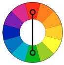
Harmony of contrasting colors
When starting to create contrasting harmonious combinations, first select the initial color, then determine the corresponding contrasting color. By creating a harmony of contrasting colors, you can add achromatic colors to each of the combined colors.
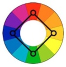
Harmony of contrasting colors. Square
"Square"- a type of harmonious combinations of contrasting colors from four colors, equidistant from each other.

Harmony of contrasting colors. Tetrad
"Tetrad"- a type of harmonious combinations of contrasting colors of four colors, in which there are two pairs of colors located opposite each other.

Harmony of contrasting colors in nature
- Harmonic combinations of related and contrasting colors – the most common type of color harmonies, forming an isosceles triangle in the color wheel. Here harmony is achieved through the use of a color and colors adjacent to its complement. These colors are softer than simply combining two complementary colors.
Harmony of related and contrasting colors
A characteristic feature of composing harmonious combinations of related and contrasting colors is the presence in the combinations of the same number of main and contrasting colors.
Harmony of related and contrasting colors in nature
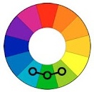
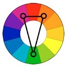
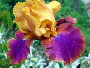
- 5. Harmonic combinations "Triad" - a combination of three colors equidistant from each other and forming an equilateral triangle in the color wheel. This scheme is popular among artists because it offers strong visual contrast while maintaining balance and color saturation. This composition looks quite lively even when using pale and desaturated colors.

The Triad harmonies demonstrate very distinct and strong color combinations, but are the most difficult to create correctly. To achieve harmony in the triad, one color is taken as the main color, and the other two are used for accents.

Triad in nature
However, it should be remembered that in creating color harmony great value have not only the colors themselves, but also the configuration of the spots, the size of the areas of the compared color tones. There is an obvious relationship between the different colors of any composition, each color balancing or highlighting the other, and two colors together influencing a third. Changing one color leads to the destruction of the coloristic, color harmony of the work of art and makes it necessary to change all other colors.
One-tone harmony (in color science literature it is also called monochrome) is based on a combination of colors of the same color tone, with differences in lightness and saturation.
The overall color tone gives this color composition a calm, balanced character. This type of harmony is very widely used in painting, decorative and applied arts, and clothing design. But it is undesirable to use it in the interior, since the monopoly of one color in space, and even in large quantities, causes discomfort in the human body, up to the manifestation of psychophysical disorders.
On our color wheel, this is a combination of colors from 5 levels of color tone.
The number of steps, naturally, can be large. The achromatic equidistant color range (from white to black) is also harmonious.

Monochromatic harmony in hair color design:

Harmony of related colors (nuances).
The harmony of related colors is based on the presence in them of an admixture of the same main color.
![]()
The main colors are:red, blue, yellow and green. This is a relatively restrained color scheme. For example, on our color wheel these are red and red-orange, yellow and yellow-red, but not red and yellow. That is, related colors are colors taken from the intervals from a given color to the next main one.
In the color wheel, or more precisely, in the color wheel system, there are 4 groups of related colors: yellow-red, blue-red, yellow-green, blue-green.
Let's look at how you can harmonize three related colors - pure red, red-orange and orange. The combination of these colors taken from circle III does not produce a subtle color combination. To achieve harmony in a given color combination (and this is a balance of shades), it is necessary to balance the colors by changing their saturation or lightness. Therefore, it is better to take red from circle III, red-orange from circle II, orange from circle I (or II). You can also add a darkened rather than a lightened color to the two colors, that is, take them from circles 4 and 5.
Thus, equally saturated color tones of the same lightness cannot form subtle color combinations. But if you add a darkened or highlighted color to one or two colors out of three, the colors begin to combine harmoniously, focusing attention on the third, most saturated color.

Polar harmony.
Polar harmony is built on the opposition of two main colors, which can be either complementary or contrasting.
For example, red and green, blue and yellow, yellow and purple. In polar harmony, not only two colors can be combined, but more. For example, pink, light green and dark green. The main thing is that these colors are varieties of the two main polar colors.
Many researchers consider this harmony to be the most comfortable for the eyes. A special combination of contrasting colors, since the phenomenon of consistent contrast is the law of our body’s desire for balance and self-defense.

Physiologist E. Hering proved that the eye and brain require medium gray, otherwise, in its absence, they lose calm. A mixture of complementary or contrasting colors gives a neutral gray color. A mixture of pure spectral colors produces white. On our color wheels, all diametrically located colors give a gray color in the mixture, that is, they form harmony. All color combinations that do not add up gray, for example, red and blue, yellow and red, are expressive.
The combination of polar colors is characterized by the greatest activity, dynamism and tension. If you combine polar colors of the same lightness, then such a combination will dazzle your eyes.
There are several ways to bring them into a harmonious combination:
1. One of the colors should be smaller in area.
2. Add white or black to one of the colors;
3. Take all colors whitened or darkened;
4. Add a contrasting color to one of the colors. For example, if in pure contrast. For example, if you add a little green to pure red, it will become gray-red and will harmonize well with green;
Let's look at point 1 in more detail. Since proportionality is the main condition for balance (remember that Proportion is the daughter of Harmony!), Itten, based on Goethe’s conclusions, proposed in his book “The Art of Color” the following proportional approximate ratios of spots of contrasting colors:
Yellow: purple = ¼: ¾
Orange: Blue = 1/3: 2/3
Red: green = ½: ½

The presented quantitative relationships are valid only when using colors in their maximum saturation. As can be seen from the proportions, warm colors, which have a greater lightness, should be smaller in area than cold colors, since the power of their influence is much more active than cold ones. Compliance with this rule will help create polar color harmony that is comfortable for our eyes.
Harmony built on the principle of constructive construction (colors are located at the ends of geometric shapes inscribed in the color wheel: triangles, rectangles, pentagons, etc.)

Summarizing all that has been said, we can formulate the basic principles of constructing color harmonies:
The principle of uniformity of colors (monochromatic harmonies);
The principle of subordination of colors (related harmonies);
The principle of complementarity (polar harmonies of complementary colors);
The principle of opposition (polar harmonies of contrasting colors);
The principle of constructive construction (colors are located at the ends of geometric shapes inscribed in a circle: triangles, pentagons, etc.).
Let's take a closer look at the last principle. Many artists and designers adhere to the “good old” rule - not to combine more than 2-3 colors in a composition. Then you get very harmonious combinations. The strongest harmonious consonance is created on the basis of equilateral triangles. If three colors are taken at the ends inscribed in the color wheel of isosceles triangles, then they will also form a harmonious unity.
And if you still need to combine more than three colors, then to avoid a cacophony of colors, you can follow several methods:
*Combine colors according to the principle of constructive construction;
*Add one color to all colors;
Make one color dominant in the composition. This color will dominate in its total area in the color composition, and in its distribution on the plane it will become “all-encompassing”, that is, it will surround all the colors on all sides;
A color composition is created from equally small color spots. This method was used by French impressionistic artists of the 19th century - pointillists (J. Seurat and P. Signac), who created their harmonious paintings with small strokes and dots.
Harmony of complementary colors on the color wheel

Split complementary scheme

Tertiary scheme of color harmony
When working with color, the artist's goal is to create color harmony. In general, harmony can be described as a combination of parts that gives a pleasant sensation (music, poetry, etc.). Color harmony- this is the consistency of colors among themselves as a result of the found proportionality of their areas and shapes, balance and consonance, based on finding a unique shade of each color. This harmony should evoke certain positive feelings and sensations in a person.
According to the nature of psychophysiological perception, it is customary to subdivide harmonic combinations into five color groups: monochromatic harmonious combinations of colors, harmonious combinations of related colors, harmonious combinations of contrasting colors, harmonious combinations of related-contrasting colors and harmonic combinations “Triad”.
1. Monochrome harmonic combinations built on the basis of one color. They are created by combining a chosen color with its light and dark shades, obtained by adding white and black. As a result, you can achieve, on the one hand, a strong tonal contrast, and on the other, subtle color relationships. The overall color tone gives monochromatic combinations a calm, balanced character.
Monochrome harmony
Depending on the tasks, color harmony can be organized in different lightness ranges. For example, using the full light range expresses peace and stability. The selection of colors separated from each other by different intervals contributes to the manifestation of activity and color intensity. To express dynamic contrast, choose two colors with a small tonal interval between them and a third with a larger interval. A uniform ratio of areas occupied in combined colors affirms statics, while an uneven ratio asserts dynamics.

Monochrome harmony in nature
2. Harmonic combinations of related colors achieved by using three colors that are adjacent to each other on the color wheel. Due to their proximity, these colors are easy to combine. This harmony can have a lot of depth, it is characterized by rich originality and an elegant appearance. The harmony of related colors is based on the similarity of color tones (or on their slight contrast in color tone) and evokes a feeling of balance and calm.

Harmony of related colors
The introduction of a small amount of white or black into combinations of related colors leads to harmony and enhances the emotional expressiveness of the composition. Harmonies of related colors are characterized by an active light contrast, which contributes to the expressiveness of tonal combinations. For example, three equally saturated color tones of equal lightness do not form subtle color combinations. As soon as black or white is added to two of the three colors being combined, the color combinations become consistent.

Harmony of related colors in nature
3. Harmonious combinations of contrasting colors are created by using two colors that are opposite each other on the color wheel. This technique is usually used to create accents, since combinations of these pairs of colors have the greatest color contrast, causing an active sound, tension and dynamism of the composition. This allows one color to complement another in such a way that one is the focal point while the other is the background.

Harmony of contrasting colors
When starting to create contrasting harmonious combinations, first select the initial color, then determine the corresponding contrasting color. By creating a harmony of contrasting colors, you can add achromatic colors to each of the combined colors.

Harmony of contrasting colors. Square
"Square"- a type of harmonious combinations of contrasting colors from four colors, equidistant from each other.

Harmony of contrasting colors. Tetrad
"Tetrad"- a type of harmonious combinations of contrasting colors of four colors, in which there are two pairs of colors located opposite each other.

Harmony of contrasting colors in nature
4. Harmonic combinations of related and contrasting colors – the most common type of color harmonies, forming an isosceles triangle in the color wheel. Here harmony is achieved through the use of a color and colors adjacent to its complement. These colors are softer than simply combining two complementary colors.

Harmony of related and contrasting colors
A characteristic feature of composing harmonious combinations of related and contrasting colors is the presence in the combinations of the same number of main and contrasting colors.

Harmony of related and contrasting colors in nature
5. Harmonic combinations "Triad" - a combination of three colors equidistant from each other and forming an equilateral triangle in the color wheel. This scheme is popular among artists because it offers strong visual contrast while maintaining balance and color saturation. This composition looks quite lively even when using pale and desaturated colors.

The Triad harmonies demonstrate very distinct and strong color combinations, but are the most difficult to create correctly. To achieve harmony in the triad, one color is taken as the main color, and the other two are used for accents.

For an artist, color harmony is a special pleasure. It can give birth to a whole range of feelings, emotions and images in his imagination. This is why many artists collect beautifully colored photographs.
There are many sites on the Internet that allow you to create similar photo color palettes. Here are some of them.
The owner of this wonderful site, Jessica, collects harmonious color combinations, illustrated with photographs of these flowers.
And these shades are so subtle and “tasty”, so different, that the imagination is immediately spurred on by the emotions generated by the color. I would like to create my own paintings using this color hint.
The Design Seeds website has a convenient search by color shades and subjects.
Winter, spring, minerals, succulents, flora and fauna..
This is what the search page looks like, everything is intuitive.

2.DeGraeve
 A good Generator that allows you to create a color palette for any photo from the Internet. For this Just insert the URL of the photo and click the “Color-Palette-ify!” button.
The generator creates two color scales - the basic natural colors of the photo and their more saturated analogues.
The downside of this generator is that not every user knows how to find the URL...
More useful materials:
 On this site you can upload your photo and also get its main colors in two scales:


The downside here is that the original photo is not visible.

Click on the button “Select Image” and select a photo on your computer. We download and get this diagram, where you can select the number of shades. Their maximum number is 8.

It’s more convenient now, right? And the colors are more natural and harmonious.
 Select the file on your computer and click “Create palette”.
We get this scheme with fifteen shades:

It's a good toy, isn't it?
If you still don’t understand color well, then it can be used to select a shade for a painting. Separated from the landscape, it is more understandable.
But are these colors harmonious?
How to choose harmonious color combinations?
Other color generators will answer these questions.
They select colors based on color schemes.

Use your mouse to select a color on the color wheel. On the right you will see a diagram of monochrome harmony.
Above the wheel there are buttons for selecting other color schemes.
To get the result in the form of a scale, click on the color tables button at the bottom right.


7.SessionsCollege

Another similar generator, but with fewer colors in the results .
Choose a color on the color wheel.
We choose the number of colors to combine and the scheme.

These generators are made for website and blog creators.
They allow you to quickly find shades that are harmonious in color and, by copying their digital name, use it.
For an artist, such sites can become a “toy” for developing a sense of color harmonies and for inspiration.
If you want more fundamental knowledge in understanding color harmony for painting:
- how to choose harmonious
- how to mix the right ones, how to express the desired image with color
then you can learn all this in the course
This is how we study color harmonies there in practice:

After all, in painting everything is somewhat more complex and multifaceted than in design...
I would be grateful for your comments on the article. And if you took my color science course, share your impressions and successes!
As you know, all the colors that we see can be divided into achromatic (white, black, shades of gray - there are no color waves, there is only lighting.) and chromatic (colors of the spectrum, color waves that our eyes perceive). Color waves smoothly transition into each other, creating color continuum- continuous smooth color change.
These two directions do not exist separately, chromatic colors (the entire continuum) are mixed with achromatic ones, which gives the whole range of shades that our eyes see. The entire range is most successfully represented in Munsell's three-dimensional "Tree".

Admixtures of different achromatic colors form different tonal directions.
If you mix pure color with white, you get light colors, with black - dark.

If we talk about color as color waves, then gray color is a mixture of color with its opposite (i.e., for example, orange and blue), the two waves “quench” each other and the color saturation is lost. Therefore, soft colors (mixed with gray pigment, with the opposite wave, in fact) look “complex, nuanced.” So, a mixture with gray gives " soft colors."

If we talk about artistic color harmony, then not all chromatic colors of the continuum look good with each other, they are combined with a certain rhythm. Colors with golden undertones are considered warm , colors with blue - cold . There are also colors that are neutral in temperature characteristics, located in a continuum between two shades.

In total, we have 6 color characteristics, 3 pairs of dichotomies
.
Dichotomy is a scale. It's not so much an either/or choice as it is being on that scale. For example, both colors can be warm, but one is distinctly warm and the other is closer to neutral.
The generally accepted color characteristics are:
Lightness: light
(with white admixture) or dark
(with black admixture).
Brightness (saturation): bright
(almost free of impurities, rich pigment) or soft
(low pigment, close to gray, gray admixture)
Hue (color's place on the continuum). This includes the division of colors into warm
(with golden undertones) or cold
(with blue undertone)

Any color is described by all three characteristics, however, they are expressed with different intensities. This provides a variety of shades. The characteristic that is most pronounced has the greatest effect on the perception of color, while other characteristics make adjustments. If you combine all the color characteristics, you get 48 options - 48 colors that transform into each other . I have already told you how they transform into each other. This is an absolutely unique author’s development, so I think there will be no questions about what system I work with - I work with MY “Color Harmony” system, built entirely on color theory, due to which it is more accurate than most other color theories, if not everyone.

All the colors of the continuum can be divided into these cells with blurred boundaries. However, in practical use, 48 palettes is a lot; too many colors will be repeated. Therefore, it is best to reduce the number of palettes to 12. Why 12? I'll explain now. As I said, the perception of color and its compatibility with others is most influenced by the leading characteristic, the most pronounced one. This means that we have 6 directions - bright colors, soft, light, dark, warm, cold. In bright colors, the purity of color is primarily visible, in soft ones - a gray admixture or “complexity” of color, in dark ones - depth, darkness, in light ones - whiteness, airiness, in warm ones - gold, warmth, in cold ones - iciness, blueness.
Compare cold soft coloring and soft cold. In the first case, the blueness and coldness catches the eye. in the second there is complexity, a gray admixture.


The temperature characteristic is also important to us - since it is precisely when the temperature undertone does not match that the skin optically reacts with unpleasant effects (yellowing, pallor, redness, colored shadows) - this is optics. The waves overlap each other and give an unnatural color.
Therefore, those directions where the temperature characteristic is not the first should be divided into two more subgroups.
The results are bright warm, bright cold, soft warm, soft cold, light warm, light cold, dark warm, dark cold.
In the case of colors, where temperature is the leading characteristic, brightness is important - pure colors or complex ones. Therefore, they are divided in this way: warm bright and warm soft, cold bright and cold soft.
It turns out 12 colors, and a simplified color globe will look like this:

Some color systems use the old "seasonal" color names, which does not affect anything other than terminology.

Each person falls into one color out of 12, but with certain amendments and individual transitions. All colors of a person's appearance have the same set of characteristics , it doesn’t happen that your skin is cold and your eyes are warm, everything is painted from the same palette, otherwise the colors of your appearance would not be harmonious. This is the law of nature =)


All colors within the main color scheme are suitable for a person, and in addition to them, some colors of neighboring colors are suitable, which are simply added to the individual palette. U different people These "supplements" are different.
And I present myself 12 colors that, in principle, are already familiar to you.
I will call them by their characteristics, although seasonal names will remain for now to correlate terminology =)
And a small bonus - the palettes now have Pantone coordinates (Pictures in large resolution can be downloaded from Google drive https://drive.google.com/file/d/0B2SlBFbzV-EYOHZYSFlRa19YY1E/edit?usp=sharing, reposting pictures in other places is welcome , but only if there is a link to us =)), in addition, I have slightly supplemented some palettes. Pantone colors are often requested from me. Although in home use it is easier for clients to use classic 12 tone types.

And.. I present 12 colors. Each of them evokes some associations, I will give them too, but the color is not limited to these associations only - they will only let you feel the “spirit” of flowers, components of the palette. But in any particular case, colors can carry different associations(!) depending on their use. But I hope I will be able to show all the colors from their the best side=) After the name of each palette there will be links to my pinterest, where I will gradually collect colors and associations, this will help you imagine the colors “in action”.
Bright cold color. ("Bright Winter") "Impressive" palette - "impressive" .
The leading characteristic is brightness, the additional one is neutral-cold. It can be either relatively light or relatively dark. Often contrasting in lightness. The colors are pure, either without obvious impurities or with a bluish admixture.
The general impression of the palette is brightness and catchiness, although there is also some restraint due to the blue undertone.
The palette is reminiscent of a winter landscape on a bright day with its color contrasts of pure colors, white, black, red and cool green, or tropical islands with bright birds, flowers, turquoise water, blue skies and emerald greenery.

Bright warm color. ("Bright Spring"). Creative Palette - "Creative" palette.
www.pinterest.com/shahrazade/ch-bright-a nd-warm/
The leading characteristic is brightness. Additional - neutral - warm. It can be either relatively light or relatively dark in color. The colors are pure, either without obvious impurities or with a bright golden admixture.
The palette is associated with the world of South Asia, with the bright clothes of the inhabitants of this region, splashes of color in their manner of combining colors, with the cheerful colors of tropical nature.

Soft cold color ("Soft Summer") - Mysterious Palette - Mysterious palette
The leading characteristic is softness, the additional one is neutral - cold. It can be either relatively light or relatively dark. The colors are softened, with a hint of gray or grayish blue.
The palette is associated with twilight, fog, forest before rain, creating the impression of mystery, understatement, riddle. The colors are very complex and nuanced.

Soft warm color ("Soft Autumn") - "Sensual Palette" - "Sensual" palette
The leading characteristic is softness, the additional one is neutral - warm. It can be either relatively light or rather dark in color. The colors are softened, with a grayish admixture or softened ocher.
The palette is associated with earthly sensual femininity, with the time before sunset, when the sun paints everything in soft golden tones, with the gifts of Mediterranean nature - the greens and gold of the fields, with grapes, cinnamon, olives, figs.

Dark cold color ("Dark Winter") "Luxorious Palette" - "Chic" palette
The leading characteristic is dark, the additional one is neutral - cold. It can be either quite bright or slightly softened. The colors are deep with a touch of black or dark blue.
Associated with the luxury of royal courts, with the velvet of deep burgundy, purple, lilac, blue shades, with rubies, emeralds, jade and malachite, as well as the dark night and the depth of the dark blue sky.

Dark warm color ("Dark Autumn") - "Exotic Palette" - "Exotic" Palette
The leading characteristic is dark, the additional one is neutral - warm. It can be either quite soft or quite bright. The colors are deep, with black or dark ocher admixture.
Associated with the colors of the Middle East - with the rich furnishings of Moroccan interiors, the gold of natural fires, the warmth of spices, the sensual complexity of colors, the rich colors of southern nature.

Light cold color (“Bright Summer”) - “Innocent Palette” (“Innocent” palette)
The leading characteristic is light, the additional one is neutral - cold. It can be either quite bright or quite soft. The colors are light, pastel, with white or light blue admixture.
The palette is associated with tenderness, freshness, childhood, as well as with a holiday at sea, with light turquoise water, light greenery, yellowish white sand, delicate flowers and carefree.

Light warm color (“Light Spring”) - “Tender Palette” - “Gentle” palette.
The leading characteristic is light, the additional one is neutral-warm. It can be either quite bright or quite soft. The colors are light, cheerful, with white or light golden admixture.
The palette is associated with youth, joy, blossoming fruit trees; all colors are permeated with delicate gold and reminiscent of the rebirth of nature.

Warm bright color (“Warm Spring”) - “Lively Palette” - “Cheerful” palette
The leading characteristic is warm, the additional one is bright. It can be either quite light or quite dark. Colors with a clear bright golden undertone.
The palette is associated with a meadow at the height of spring with a variety of bright colors - lilac, yellow, red, violet, with the golden color of the sun and the blue of the spring sky.

Warm soft color (“Warm Autumn”) - “Spicy palette” - “Spice Palette”
http://www.pinterest.com/shahrazade/ch-warm-and-soft/
The leading characteristic is warm, the additional one is soft. It can be either quite light or quite dark. Colors with a clear ocher undertone.
The palette is associated with spices - pepper, turmeric, cloves, saffron, mustard and with autumn nature, deep blue water and warm colors of foliage.

Cold bright color (" Cold winter") - "Noble Palette", "Noble" palette
The leading characteristic is cold, the additional one is bright. It can be either quite dark or quite light. Colors with a bright blue undertone.
The palette is associated with the world Snow Queen- with icy luxury, detachment and some drama, this is a palette of precious stones.

Cold soft color - ("cold summer") - "Elegant Palette" - "Elegant" palette.
The leading characteristic is cold, the additional one is soft, it can be either quite light or quite dark. Colors with soft blue undertones.
The palette is associated with elegance, with the subdued colors of northern summer with the blue of cool water, bluish-green summer foliage and hints of berries.

All information in this article is the intellectual property of the author, so reposting is only with an indication of the source. =)
Path to Your Charm Project 2014, Color Harmony 2014
Color harmony
The phenomenon of color is not at all simple. As already noted, on the one hand, color refers to the physical properties of reality, it can be measured using instruments, and its properties can be mathematically modeled in the same way as in colorimetry, and in this capacity color has an objective meaning. On the other hand, color is a subjective psychophysiological sensation that is embodied in certain emotional states that differ from person to person; and this ambiguity of it represents for fine arts main interest.
When analyzing color image technology, it is necessary to always remember these two aspects of it: natural science and psychoaesthetic. If we consider the phenomenon of color in historical terms, then these two approaches reveal themselves quite clearly. At the same time, attempts to understand what color is and what its significance is in fine art and in culture in general are always expressed in the desire to somehow systematize color, to create a unified system, and on its basis to penetrate the mystery of harmonic combinations. It is quite possible that color harmony is not an objective reality that just needs to be discovered, as many believed following Newton, but just a property of our aesthetic consciousness, as Goethe believed; harmony does not exist outside of our perception, just as the concept of color does not exist outside of perception. Therefore, in different historical eras, different nations Various harmonious combinations prevailed, or rather, completely different color combinations were considered harmonious or inharmonious.
Let's follow in the most general outline the dynamics of changes in the coloristic ideal based on the material of fine art. But first, a few words about the symbolism of color.
The problem of color symbolism is connected both with the psychological impact of color and with its taxonomy and classification. At the origins of culture, color was equivalent to a word, since it served as a symbol of various things and concepts, and the most stable color symbols were the simplest or primary colors. It has been noted that the role of color symbolism in a society is proportional to the share of mythology in its thinking. As the role of rationalism increases, the role of symbolism decreases. In our time, color symbolism retains its position in heraldry, functional coloring of production facilities, in transport signaling and in surviving everyday ritual actions.
In more complex cases, such as in art, the treatment of color allows for the same freedom (or rather, ambiguity in interpretation) as the treatment of words in modern literature. Today, some theoretical premises in coloristic decisions, based on the symbolism of color, in many ways seem too speculative and unconvincing. The color scheme itself can be very interesting and innovative (as, for example, in the film by cinematographer V. Storaro “Reds”), but theoretical justifications based on subjective symbolism look like completely unnecessary props; There is even some degree of mystification in all this. Thus, Storaro argued that the gray-brown tones in his film symbolize the earthly aspirations of the characters, like the roots and trunk of a tree, and green and generally rich shades, corresponding to the fresh greenery of the crown and flowers, symbolize their inner, spiritual world.
In the future, when analyzing the issues of color, we will talk in detail about the specifics of film color, about the metaphorical nature of color in cinema, but here I would like to note that discussions about the symbolism of color in cinema are mostly artificial and far-fetched.
In the era of Greco-Roman antiquity, color became the subject of attention and reflection of philosophers, but the views of color philosophers can be called more artistic than scientific, because their worldview was based on aesthetic and even ethical prerequisites. Ancient philosophers considered it obligatory to classify colors - to distinguish main and derivative ones, but they approached this mainly from a mythological position. In their opinion, the main colors should correspond to the main elements (air, fire, earth and water - white, red, black and yellow). Nevertheless, Aristotle already knew the phenomenon of color induction, simultaneous and sequential color contrast, and many other phenomena, which were then used as the basis for physiological optics. But the most important thing is the doctrine of color harmony.
Ancient color aesthetics became the same foundation for all European art of the Renaissance as ancient philosophy was for the science of the Enlightenment. Harmony was considered a universal principle of the universe and was applied to many different phenomena: to the structure of the Cosmos, to the social structure, to architecture, to the relationship of colors and numbers, to music, the human soul, etc. In its most general form, harmony meant the principle of a higher, “divine” order, established not by man, but higher powers, but, despite this, such an order should be completely accessible to human understanding, since it is based on reason. This, by the way, is the difference between the Western concept of harmony and the Eastern one, in which there are always elements of mysticism and unknowability.
Here are some provisions ancient harmony in relation to color:
1. Communication, the combination of individual elements of the system with each other. Harmony is a connecting principle. In color this is expressed by the unity of color tone, when all colors are brought together as if by a common patina, each paint is either whitened (in the background), or blackened, or softened by mixing another paint. Apelles, according to Pliny, having completed the painting, covered it with something like a grayish varnish in order to bind all the colors into a harmonious unity.
2. The unity of opposites, when certain opposite principles, called contrasts, are present. In monochromes, this is the contrast of light and dark, chromatic and colorless (for example, purple with white, red with black), saturated colors with low-saturated ones. Or are they contrasts in color tone - a comparison of red and green, yellow and blue, etc., i.e. connection of additional, complementary colors.
3. Only something connected with a measure can be harmonious, and a measure is human sensations and feelings. According to Aristotle, every sensation is a determination of relationships. The brightness and strength of the color should be neither too strong nor too weak. Bright color, sharp contrasts were considered barbarism, worthy of “some Persians” (the original enemies of Hellas). A civilized Greek values beauty more than wealth; the subtlety of art pleases him more than the high cost of material.
4. The concept of measure is relative, it means the ratio of the measured quantity to the unit of measurement, therefore it includes such definitions as proportionality, proportions, ratios. Aristotle believed that in “beautiful” colors the proportions in which the primary colors are taken are not accidental: “Those colors in which the most correct proportionality is observed, like sound harmonies, seem the most pleasant. Such are dark red and violet... and some others of the same kind, which are few for the reason that musical harmonic consonances are few.”
The entire practice of ancient applied art is based on the principle that mixedness in color is more valued than purity.
5. The harmonic system is stable because it is balanced. The Universe is eternal because it is harmoniously arranged; the opposing forces in it cancel each other out, creating a stable balance. If in the picture the figures are dressed in bright cloaks, then these relatively saturated spots occupy no more than one-fifth or one-sixth of the entire picture in area. The remaining colors are low-saturated. Light to dark is taken in approximately the same ratio. Thanks to this proportional system, an overall balance of the color composition is achieved: strong, but short pulses of bright and pure colors are balanced by longer, but weak fields of dark and mixed ones.
6. A sign of harmony is its clarity, the obviousness of the law of its construction, simplicity and logic both as a whole and in parts. A classic color composition does not pose difficult tasks for the viewer; comparisons of close or opposite colors are preferred in it and comparisons in the middle interval are almost never used as a color dominant, since they have neither an obvious connection nor opposition (more on this will be said using the example of color circle).
7. Harmony always reflects the sublime. According to Aristotle, “mimesis” is a reflection of reality in the forms of reality itself; art only imitates nature, but does not reproduce the ugly and ugly - this is not the task of art.
8. Harmony is conformity and expediency, as well as order. This principle expresses in the most general form the attitude of ancient aesthetics to the world: the goal of human cultural activity is to transform the formless and ugly world of chaos into a beautiful and ordered cosmos. Any harmonious color composition is so organized and orderly that it is easily comprehended by the human mind and lends itself to logical interpretation.
From this listing of the main features of ancient color harmony, it is clear that many of them have not lost their meaning to this day.
In the Middle Ages, color served as a kind of means of communicating information or as a sign that distinguished certain objects. There was a kind of color code that was understandable to all members of society. It was used in all visual structures, in all creations of human hands that were visible: in architecture, decoration of temples and palaces, clothing, painting, sculpture, book graphics, theater. Moreover, in relation to different colors, there was the same hierarchy as in all other areas of life. There were “main, divine” colors: white, gold, purple, red and blue, as well as yellow (it depicted gold). Below on the hierarchical ladder were green and black. The same colors as gray, brown and the like seemed not to be noticed at all and they tried not to use them. It was believed that the contemplation of “divine” and “royal” flowers elevates a person’s spirit, instilling in him a pious system of thoughts. In France and Italy, the use of blue paint was even controlled by the state, just as it was done in relation to purple in late antiquity. The symbolic meaning of white color was enshrined in the Holy Scriptures; white color meant holiness, faith, etc. Black color as a symbol of death meant mortification of the flesh and was generally a sign of humility and renunciation of worldly joys. Hence the black color of the clothing of the clergy and monasticism. However, for the highest clergy - the prelates of the Roman Church, the “non-representative” black color was replaced by purple, because purple is closest to black.
During the Renaissance, the works of Leon Baptiste Alberti (1404-1472) and Leonardo da Vinci (1452-1519) were more closely associated with the practice of fine art and have not lost their relevance to this day. The issues raised in them can be divided into two groups:
1) all kinds of color phenomena in nature and painting, the influence of illumination on color, reflexes, aerial perspective, interaction of colors (color induction, color contrasts, color of the human body, some features of visual perception of color irradiation, adaptation and edge contrast);
2) questions of color aesthetics in relation to painting, i.e. which color combinations should be considered harmonious and which should not. Today it is not superfluous to recall what Alberti wrote several hundred years ago: “It seems obvious to me that colors change under the influence of light, for every color placed in the shadow appears different from what it is in the light.”
Unfortunately, for many of our contemporaries this does not seem so obvious. “Colors are very similar to lights in terms of visibility; and how related they are, you see by the fact that in the absence of light, colors are absent, and when light returns, colors return.”
Essentially, here is a basic statement that characterizes the entire process of tone and color reproduction when changing exposure.
In the Renaissance understanding, in comparison with the ancient one, the main characteristics of color (hue, lightness and saturation) are already different, as we now say. It is interesting that white and black are denied the name of colors, but they are recognized as the main colors in painting. “Black and white,” writes Leonardo, “although they are not considered colors, since one is darkness, and the other is light, i.e. one is a deprivation, and the other is a product of color - yet I do not want to leave them aside on this basis, since in painting they are the main ones, for painting consists of shadows and lights, i.e. from light and dark."
Despite the fact that Renaissance theorists are unanimous that the main means in painting are drawing, composition, perspective and chiaroscuro, and color is given a secondary, as if decorative role, they, contradicting themselves, vigilantly note reflexes and colored shadows. Leonardo writes: “The color of the shadow of each object always participates in the color of the object casting the shadow, and to a greater or lesser extent, the closer or farther this object is from this shadow and the more or less luminous it is. The surface of every shaded body participates in the color of its opposing object.” “White is more susceptible to any color than any other surface of any body, so long as it is not mirrored.”
And Alberti writes about reflexes: “A person walking through a meadow in the sun appears green in the face.”
Leonardo continues: “It often happens that the colors of the shadows on shaded bodies do not agree with the colors in the highlights, or that the shadows appear greenish and the highlights pinkish, although the body is of the same color. This happens if light comes to an object from the east and illuminates it with the light of its radiance, and from the west there is another object illuminated by the same light, but it itself is of a different color than the first object. Therefore, it throws its reflected rays back to the east and illuminates the side of the first object facing it with its rays. I often saw red lights and bluish shadows on a white object.”
These observations by Leonardo were used in painting only in late XIX centuries by the impressionists, and he himself, contrary to obvious facts, in his artistic practice could not overstep the traditions of local painting and warned his contemporaries against this. For artists of the early Renaissance, the color of objects was presented as their integral property; it always appeared unchanged and was only diluted or, accordingly, darkened with white or black paint, so the problem of color harmony was solved for them by combining subject or local colors, which were appropriately based on the composition , were grouped on the picture plane.
Everyone knows the masterpieces of the Renaissance, where amazing decorative effects were achieved in this way. These are paintings by Raphael, Michelangelo, Botticelli and other artists associated with the culture of the Correggio Academy. Later, the Renaissance had a completely different attitude towards the aesthetics of color comparisons than Alberti and Leonardo, who considered the contrast of local colors to be the basis of harmony. Later, the aesthetics of harmony through opposition gave way to the aesthetics of harmony through analogy, if we speak in modern language. But bright decorative effect, which is achieved by the harmony of local colors, is still used in painting. For example, in the paintings of Petrov-Vodkin.
There is an interesting point of view that explains why Renaissance artists painted with local colors. The fact is that the technique in which they worked (tempera) did not allow one layer of paint to be applied to another. This became possible when the Van Eyck brothers began using oil paints. If we accept this version, we will have to admit how strongly technology influences aesthetics, which is confirmed today by the example of color photography, cinema and television.
The 17th century was a turning point in the history of European culture. Rationalism and mechanism became the main methods of science. Researchers saw their task in dissecting the object under study, dividing it into its component parts, while, of course, analysis dominated synthesis, and systematic approach, as we are now saying, was impossible in this case. Despite this, Newton can be considered the founder of the physical science of color, because he put it on a solid foundation of physical experiment with mathematical processing of the results. He asserted the organic unity of light and color, their physical identity, and believed that color always exists and only appears under certain conditions: “I found that all the colors of all bodies are generated only from a certain arrangement that facilitates the reflection of some rays and the transmission of others.” . Newton created an objective physical basis taxonomy of color by capping natural spectral colors with purple and arranging them in a circle.
Fig. 12 Newton's color circle.
This circle (ill. 12) turned out to be very convenient tool to calculate the results of mixing color rays (additive synthesis).
Somewhat later, it was Newton’s teaching that prompted Goethe to take up the study of color, as we would now say, on an alternative basis, as a result of which physiological optics and the doctrine of psychological impact colors.
In the 19th century, scientific color systematics were already used by painters; Delacroix showed how to use the color wheel and triangle to facilitate the solution of color problems, and in the 70s, impressionists and neo-impressionists were already using the optical addition of colors in their artistic practice. This could not be done without knowing Newton's teachings.
The great Flemish painter Rubens at one time provoked fierce attacks from his colleagues because his palette was more multicolored than the canons of classicism allowed. Color in Baroque art then came to one of the main places, but this was not conceptualized theoretically, and only in 1673 Roger de Pille, in his “Dialogues on Color,” described the features of this style in relation to painting.
1. Color is not a secondary means: “In paintings, well-developed color is especially appreciated, even if the drawing is mediocre. And precisely because drawing can be found in other things: in engravings, statues, reliefs... at the same time, we find beautiful coloring only in paintings.”
2. In coloring one should not be afraid of exaggeration: “Just as a draftsman adjusts the proportions of his model, so a painter should not literally reproduce all the colors that he sees; he selects those that he needs, and if he considers it necessary, he adds others in order to obtain an effect that will contribute to the achievement of beauty.”
3. In painting there is no difference between chiaroscuro and color; chiaroscuro is inextricably linked with color: “Properly used lights and shadows do the same job as colors.”
4. Light and color are compositional elements: “The ability called “light-dark” is the ability to distribute light not only on individual objects, but on the entire surface of the picture.”
Roger de Pille believed that with a thoughtful distribution of light and shade and color in a painting, it is possible to achieve the unity of the composition, no matter how many elements there are in it. The “bunch of grapes” principle discovered by Titian was used as an example. Titian piled objects or figures together, as if in a bunch of grapes, in which the illuminated berries create an overall light mass, and those in the shadow make up a dark mass. This makes the entire group clearly visible at a glance, but at the same time its individual parts are also clearly distinguishable. Rubens lived for some time in Venice, where Tintoretto allegedly told him that Titian used this “bunch of grapes” principle in multi-figure compositions.
5. According to Roger de Pille, the basis of color harmony is made up of contrasting comparisons, as well as “sympathies of colors,” i.e. consonance of shades of the same color. And despite the fact that contrastive comparison (warm-cold) is fundamental to colorism, between two opposite colors there must always be a third, middle one, participating in one and the other in order to achieve harmony. Reflexes serve this purpose, and harmony is achieved, first of all, thanks to reflexes.
De Pille also wrote about the psychological impact of color and color associations. He divided colors into heavy and light, receding and approaching, and introduced the term “earthly” (brown) and “airy” (blue). In the coloring of objects, he distinguished between local color (usually the color of lights), reflex, glare and lighting color, and this was a big step forward.
The German poet Wolfgang Goethe wrote: “Everything I have done as a poet does not fill me with special pride. Wonderful poets lived at the same time as me, even better ones lived before me and, of course, will live after me. But that in my age I am the only one who knows the truth about the difficult science of colors - I cannot help but attach importance to this, it gives me the consciousness of superiority over many.”
Goethe fundamentally and ideologically disagreed with Newton’s position and believed that he had to fight his “delusions.” He looked for the principle of color harmonization not in physical laws, but in the laws of color vision, and we must give him his due, he was right in many respects; It is not without reason that he is considered the founder of physiological optics and the science of the psychological effects of color.
Goethe worked on his “Doctrine of Color” from 1790 to 1810, i.e. twenty years, and the main value of this work lies in the formulation of subtle psychological states associated with the perception of contrasting color combinations. Goethe describes in his book the phenomena of color induction - luminance, chromatic, simultaneous and sequential - and proves that colors arising from sequential or simultaneous contrast are not random. All these colors seem to be inherent in our organ of vision. The contrasting color appears as the opposite of the inducing color, i.e. imposed on the eye, just as inhalation alternates with exhalation, and any compression entails expansion. This reveals the universal law of the integrity of psychological being, the unity of opposites and unity in diversity.
Each pair of contrasting colors already contains the entire color circle, since their sum - white color - can be decomposed into all imaginable colors and, as it were, contains them in potency. From this follows the most important law of the activity of the organ of vision - the law of the necessary change of impressions. “When the eye is offered something dark, it demands light; he demands the dark when he is presented with the light, and demonstrates his vitality, his right to grasp the object by generating from himself something opposite to the object.” Let us remember the “pendulum of emotions” that we mentioned in the previous chapter.
Goethe's experiments with colored shadows showed that diametrically opposite (complementary) colors are precisely those that mutually evoke each other in the viewer's mind. Yellow requires blue-violet, orange requires cyan, and purple requires green, and vice versa. Goethe also built a color circle (ill. 13), but the sequence of colors in it is not a closed spectrum, like Newton’s, but a round dance of three pairs of colors. And these pairs are additional, i.e. half generated by the human eye and only half independent of man. The most harmonious colors are those that are located opposite, at the ends of the diameters of the color wheel, they call each other and together form integrity and completeness, similar to the completeness of the color wheel. Harmony, according to Goethe, is not an objective reality, but a product of human consciousness.

Ill. 13 Towards Goethe's theory of color harmony.
According to Goethe, in addition to harmonic combinations, there are “characteristic” and “characterless.” The first includes pairs of colors located in the color wheel through one color, and the second - pairs of neighboring colors. Harmonic color, according to Goethe, arises when “all neighboring colors are brought into balance with each other.” But harmony, Goethe believes, despite all its perfection, should not be the artist’s ultimate goal, because what is harmonious always has “something universal and complete, and in this sense devoid of specificity.” This unusually subtle remark echoes what Arnheim subsequently said about the entropic nature of the process of image perception and the fact that images harmonized in all respects often lack expressiveness and expression.
Goethe's book contains several very subtle definitions of color. For example, in painting there is a technique of shifting all the colors to any one color, as if the picture was viewed through colored glass, for example yellow. Goethe calls this coloring false. “This false tone arose from instinct, from a lack of understanding of what should be done, so that instead of integrity they created homogeneity.” A similar color glaze, often considered a sign in color cinematography good taste, does not deserve such a respectful attitude at all and that there are other, more advanced ways of obtaining color harmony, which, however, require more work and a higher visual culture.
The reader may think that such a large excursion into the history of painting is unnecessary, that all the issues discussed are related only to painting, but this is not so. The fact is that all of Goethe’s observations about color interactions and harmony apply not only to a colored object, but, to the same extent, to its image, since the laws of perception of color and contrast in both of these cases are the same. Otherwise, we would never be able to realize the similarity between an object and an image, and most importantly, we would never be able to experience the emotional state that arises when perceiving a work of fine art.
From the book Verboslov-1: A book you can talk to author Maksimov Andrey MarkovichHARMONY...And here is another conclusion that we repeat regularly and will repeat again: a person must move along the road to happiness, that is, a feeling of harmony with himself and with the world. But the question immediately arises: is it possible to talk about harmony in ours, absolutely
From the book The Jewish World author Telushkin JosephChapter 279 Family Harmony / Shlom Bayt If your wife is short, the Talmud teaches, bend down to hear her whisper” (Bava Metzia 59a). Although there is no shortage of unflattering statements about women in the Jewish tradition, ancient tradition Judaism proclaims and
From the book 111 symphonies author Mikheeva Lyudmila Vikentievna author Chernaya Lyudmila Alekseevna2. Harmony of the “internal” and “external” person
From the book Metaphysics stata author Girenok Fedor Ivanovich4.15. Harmony Harmony is the nail. A fastener connecting parts. Cohabitation. The ability to be together without a soul. What's together? A rough body and a cold spirit. Without harmony, the world will fall apart. The house will fall apart. The spirit will fall away from the body. There is harmony everywhere. There is music everywhere. And this is an aesthetic perception
From the book Anthropological Code of Old Russian Culture author Chernaya Lyudmila Alekseevna2. Harmony of the “internal” and “external” person In the XIV-XV centuries. in Rus' the formation was completed medieval image a person in whom ideas about human “nature” (the essence of human nature), the relationship between body and soul, “internal and external” in
From the book Color and Contrast. Technology and creative choice author Zheleznyakov Valentin NikolaevichColor harmony The phenomenon of color is not at all simple. As already noted, on the one hand, color refers to the physical properties of reality, it can be measured using instruments, and its properties are mathematically modeled as it happens in colorimetry, and in this
When creating a composition, color combinations are of decisive importance. Harmonious color combinations include color combinations that give the impression of coloristic integrity, the relationship between colors, color balance, and color unity.
When people talk about color harmony, they are evaluating the impressions of two or more colors interacting. Moreover, each person has his own subjective preferences about harmony and disharmony. For most, color combinations, colloquially called “harmonious”, usually consist of tones that are close to each other or various colors, having the same aperture ratio. Basically, these combinations do not have strong contrast. The concept of color harmony must be removed from the area of subjective feelings and transferred to the area of objective laws. The eye receives a sense of balance only on the basis of the law of complementary colors. The state of equilibrium corresponds to a medium gray color. The same gray color can be obtained from black and white or from two additional colors, if they contain 3 primary colors - yellow, red and blue in the right proportion, all color combinations that do not give us gray, by their nature become expressive or disharmonious.
The harmony of color in a composition is one of the elements of unity and completeness of the composition. To achieve this effect, you should use a color wheel. Colors are divided into warm and cold. Warm tones enliven the composition. Pure colors in this part of the spectrum are very striking and distract attention from cool colors - the shades do not look as sharp. An important property of warm colors is to bring things closer visually. Cool tones are soothing. Pure colors from the cool end of the spectrum bring peace on hot sunny days, but bright warm colors overwhelm them. An important property of cool colors is to visually distance the flowers painted in them.
The following colors and shades are harmoniously combined: colors that are equidistant from each other in one half of the color wheel. For example, green, yellow, orange; opposite colors on the color wheel. In a combination of three tones, one of them should dominate. The other two colors should be in equal quantities. This means that if the composition uses, for example, green, yellow and red tones, then one of them should be, for example, 50% of the color of the composition, the other two should be 25% each. In addition, the background for the composition should be neutral. colors (white, black, grey). Or the background includes a shade of the main color of the composition (for example, if the composition is dominated by pink, and the background for it is white, then the background will be white with a pink tint). The background is created dark for bright colors, a light background for dark colors. Color combinations create monochrome, contrasting (complementary), similar (adjacent) or polychrome (multicolor) compositions. In a monochrome composition, different shades of the same color are used. In contrasting compositions, colors that are opposite in the color wheel are used. Contrasting combinations should not be too bright.
Most color harmonies known in practice can be divided into two main types: harmony of contrasting colors and harmony of related colors. This selection is based on the distribution of colors in the color wheel. Practice confirms that either a combination of opposite or similar colors are more expressive. Accordingly, a distinction is made between the harmony of contrasting colors and the harmony of related colors. We talk about contrasts when, comparing two colors with each other, we find clear differences between them. Studying the methods of color influence, we can distinguish 7 types of contrasting manifestations:
- - Contrast color comparisons. The most pronounced color contrasts are yellow, red and blue. It creates the impression of diversity, strength, determination. As the selected colors move away from the main three, the intensity of the color contrast weakens. Based on it folk art various countries.
- - Contrast of light and dark. White and black are the most expressive means of indicating light and shadow.
- - Contrast of cold and warm. The two poles of the contrast between heat and cold are red-orange (the warmest) and blue-green (the coldest). The use of this contrast achieves perfect beauty only when there is no difference in the lightness and darkness of the colors used.
- - Contrast of complementary colors. Two colors are complementary if mixed to produce a neutral gray-black color. They are opposite to each other, but at the same time they need each other. Complementary colors, in their proportionally correct proportions, give the work a statically strong basis of interaction. Moreover, each pair of complementary colors also has other characteristics (the yellow-violet pair is the contrast of light and dark, red-orange - blue-green is the contrast of cold and warm).
- - Simultaneous (simultaneous) contrast is a phenomenon in which our eye, when perceiving any color, requires its additional color, and if there is none, it simultaneously generates it itself. Simultaneously generated colors are only a sensation and do not really exist; they evoke a feeling of living vibration from the continuously changing intensity of color sensations.
- - Contrast color saturation. The contrast between colors is saturated, bright and faded, darkened. Colors can be lightened or darkened in different ways, which give them different possibilities. The effect of this contrast is relative: a color may appear bright next to a faded tone, and faded next to a brighter one.
- - Contrast of color spread. Characterizes the dimensional relationships between color planes. Its essence is the opposition “many - little”, “big - small”. In this case, it is necessary to take into account the brightness or lightness of a particular color, since the brightness and size of the color plane determine the strength of the color’s influence. The exclusive feature of this contrast is its ability to change and enhance the manifestations of all other contrasts. Thus, if in a composition based on the contrast of light and dark, a large dark part contrasts with a smaller light part, then thanks to this opposition the work can acquire a particularly deep meaning.
The features of the harmony of contrasting colors are largely due to the fact that visually opposite colors enhance each other due to the phenomenon of contrast. This combination of colors creates a feeling of clarity, clarity, confidence, strength, firmness, and at the same time - a certain dynamics and tension. Details and form elements are figuratively accentuated and clearly highlighted. Often contrasting bright combinations flowers are used as a stimulant of fading emotions and a tired nervous system.
The use of harmony of contrasting colors in compositions has a number of features and difficulties. Contrasting colors enliven the form, give it brightness, ensure the highlighting of individual parts due to their clearly defined contours, and bring into the subject internal energy, expressiveness, individual originality. However, excessive contrast of colors can break the elements of the form, disrupt its unity and integrity. A strong manifestation of a contrasting combination of colors in some cases can produce a flashy impression.
There is also the concept of nuance. This is a shade, an insignificant, barely noticeable change from one color tone to another), from one gradation of light and shade to another. Nuance is the combination of shades, used to achieve a more refined modeling of the image object. Related colors are located in one quarter of the color wheel and have at least one overall color, for example, yellow, orange and yellow-red. There are four groups of related colors - yellow-red, red-blue, blue-green, green-yellow. In this case, the combination should not contain two contrasting colors at the same time. Color combinations play an important role in creating harmonious compositions. Color technique is the highest mathematics for an artist; Each master has his own methods for solving problems, but without “arithmetic,” that is, without knowledge of the strict laws of color theory, perfection cannot be achieved.
What is color unity, the relationship of colors, harmony and the influence of the color environment on objects? Before answering this, I would like to ask the reader the following question: which of the painting options above do you think is correct? I deliberately wrote one of the sketches with an error so that it would serve as an illustration of what not to do. There is no relationship between green and light brown in this image. They are written separately from each other and look alien. Two versions of a still life with a ceramic mug show well why the relationship of colors is important. Well, now let's look at everything in order.
Color unity and the relationship of colors in painting
To better understand what color unity is in painting, imagine a still life illuminated by a red lamp. All multi-colored objects in this still life, say green, yellow, blue, will acquire a red tint. In life, this happens when the orange light of the sunset turns the greenery of the forest orange. Or the cold light of the blue sky in the window illuminates the interior of the room. That is, light affects the individual colors of individual objects. He unites them. It's like looking into stained glass. Of course, in life this does not manifest itself as powerfully as in this example, but this is the principle. Moreover, in addition to the unifying color, the following pattern will also appear: if the light has a warm tint, then the shadows will be colder than the light; if the light is cold, then the shadows will tend to warm shades. This color contrast of light and shadow brings a play of warm and cold colors into painting. The dynamics of warm and cold bring painting to life. But we must not forget about the unifying color of lighting.

In addition to the light source, the color of individual objects will also be affected by reflected light. If we return to our still life with a ceramic mug, the brown will be reflected on the green drapery, and the green will be reflected on the brown mug. This reflection of neighboring colors is called a reflex in painting.
The examples described above show what effect the color of individual objects has. Therefore, no matter what colors objects are painted in, in painting all colors must be subordinate to each other. Such subordination and consistency gives rise to color unity. Without it, painting will be fragmented. She will lose harmony and become “decorated”.
Moreover, even if in the depicted plot the objects are illuminated with “pure” white light, and the reflexes are practically invisible, then the relationship between the colors still needs to be “invented”. That is, the artist needs to “fantasize” and bring reflexes into painting on his own, relying on the above principle, and not just on nature. After all, the subordination of colors is dictated not only by nature or physics. This prerequisite to create a harmonious and integral painting.
Color unity is very important, without it it is impossible to achieve coloristic integrity. This is similar to how spare parts of a complex mechanism must fit together. It cannot be assembled from randomly found parts. Such a mechanism will not work. All individual components and elements must function harmoniously as a single whole. Also, colors in painting should be subordinated.
But color unity does not mean that you always need to mix one color into all other colors. This does not mean that we should always write as if we were looking into stained glass. In painting, sharp, pure color can also be found, without mixing. However, it must be balanced by corresponding colors in other parts of the composition. Then it will look harmonious, and the painting will become both uniform in color and contrasting. In addition, sometimes in work it is necessary to introduce emphasis with the help of pure and saturated colors, without balancing. And it happens that somewhere the artist introduces reflexes, and somewhere he leaves the color pure. In general, everything is not so simple. However, with all this, the relationship between the local color and the environment must be preserved.
This can also be compared to the figurative “immersion” of an object in a color environment. That is, the colors surrounding an object will affect its color, which is called local color. Therefore, it is impossible to paint objects separately from their surroundings or color environment. This is due not only to reflexes and reflection of light. This is also due to the need to harmoniously combine colors. Therefore, the artist should not work like a camera, he should not simply copy nature. The artist slightly transforms the image, takes into account the above principles, and is also based on a sense of color. But what does it mean to combine colors harmoniously? To answer this question, let's look at key color harmonies.
Color harmonies in painting
In addition to color unity based on reflexes and uniform lighting, which I described above, it is also worth mentioning the subordination of colors based on color harmonies. That is, on such combinations of colors that give rise to consonance and coloristic consistency. But what are they? Let's take a closer look at the following types of color harmonies:
- harmony of related colors;
- harmony of contrasting colors;
- harmony of related and contrasting colors;
- harmony based on color repetition.
Harmony of related colors

Related colors are colors that have one common color. For example, orange and yellow are related because orange contains the color yellow. Green and blue-green, red and purple are all related colors. They are similar, that's why they are called that. If colors from the related category are nearby, then they will always harmonize with each other. These combinations can be called “win-win”. However, such color relationships are most often “calm”, “soft”. Therefore, it may be necessary to add “a little pepper to this dish,” that is, contrasting colors. But this is a different kind of harmony.
Harmony of contrasting colors

Contrasting colors are the following three pairs: red and green, blue and orange, purple and yellow. These colors enhance each other. They both contrast and create harmony. Harmony based on contrasting colors. Therefore, in some cases they can be used in pure form and at the same time they will form consonance and unity. They will be subordinated as additional colors and go well together. However, caution must be exercised here. Success depends, so to speak, on the context. Big role plays a quantitative relationship of colors. That is, how much area is occupied by one color and how much by another. The environment is also of great importance. After all, painting rarely consists of two colors.
Harmony of related and contrasting colors

As the name suggests, this harmony contains both related and contrasting colors. Therefore, this combination is probably the most difficult, but also the most interesting. Matching one contrasting color to another contrasting color is not a problem, nor is it a problem to match a related one to a related one. But combining both groups is not so easy. Let's look at an example that will help you understand this. Let's take yellow and purple as the central contrasting pair. And let's introduce blue around it. To do the impossible and bring blue and yellow closer together, we will mix them. As a result, they will not become related, but a new color will be formed - blue-green. And he will become related to both of them and act as an intermediate link. As for blue and violet, they are initially related. As a result, we will get the following colors: yellow, purple, blue, blue-green, yellow-green.
Harmony based on color repetition
Very often, the basis of color unity is simple repetition of color. When women choose an outfit, they are often guided by precisely this repetition: they match a red hat with a red handbag or a red scarf... In painting, such repetition of color also gives rise to harmony and coloristic integrity. This is especially true when the color of the picture consists of completely different, “alien” colors. This technique is implemented in painting in two ways. Let's look at them using the example of a still life with an orange.
The first method: repeating pure color in different parts of the composition
The orange pops too much against the blue drapery. To create a relationship between these opposite colors, we introduce orange into blue. For example, in the form of an ornament on this blue drapery. The ornament is simple - it's just stripes of yellow and orange. They seem to “invade” or “weave” into a large mass of blue and dilute it with warm colors. This repetition of orange in a blue environment creates their interconnection and harmony.

You can also paint in a manner similar to impressionism. That is, we introduce orange into blue in the form of strokes of paint, like a mosaic. The Impressionists loved to compose the desired shade from pure colors. They put strokes of paint different colors side by side, as a result of which they united and mixed in the eyes of the viewer. It's called optical mixing flowers. A similar method will also help combine our orange and blue.

But what if we do not write like impressionists? If the plot does not imply any ornaments in the drapery? What if we need a solid, uniform background? In this case, you can use adding orange to blue by literally, mechanically mixing them.
Second method: adding color to adjacent areas by mixing it with other colors
The easiest way to achieve unity between objects painted in opposite colors is to add one color to another so that they mix and form something in between. The main thing is to avoid dirt in such mixtures. In our case, I mix a drop of yellow and orange into the blue. We get blue with a warm tint. That is, the blue color will not be in its pure form, but in mixtures with warm colors. We do the same thing with orange. By adding a little blue or cyan to orange, we get orange with a cool tint. In this way, orange and blue “flow” into each other, which creates color unity and coloristic integrity. Moreover, this does not mean that all blue fabric should have a warm tint. You can leave its fragment in a pure blue-blue color. This will create an appropriate contrast between the drapery and the orange. But we will add yellow and orange to some fragments of this fabric, and then the blue in these places will become warmer. Then these areas will become “support” for the orange.

In the illustration, I placed a sketch with the introduction of yellow into blue and blue into orange, as well as a sketch without such mixing, where the background and orange are painted in pure colors. As you can see, the difference is not big. But it is there. In the first version, the yellow-blue mixture of colors is barely perceptible. However, this is enough to link the background color and the orange color.
In the second version, as I already said, the orange and background are written in pure yellow-orange and pure blue. However, the painting did not collapse, but remained intact. Why? As you may have noticed from the previous paragraphs, this pair of colors forms a contrasting harmony. That is, these colors, although contrasting, are at the same time harmonious. Therefore, the second sketch does not look decorated and fragmented. This means that this option is also acceptable. However, it borders on embellishment, and if other combinations and a different composition had been chosen here, then there could be no talk of any harmony.
Color or color system
Speaking about the relationship of colors in painting, one cannot help but talk about color. There are two opinions about the meaning of this word. In the first case, color means a system of color combinations in painting, built on consonance. In the second case, color is understood as the overall color of the picture, or the set of predominant colors. Therefore, you can often hear people say about some work that it was done in a warm color, or, conversely, in a cold color. There is also a warm-cold color scheme, etc.
I once came across the formulation that color is an orchestra of colors. I liked this definition the most. It emphasizes the importance of color harmony, color unity and color subordination. By the way, one of the meanings of the word “harmony” is unity in diversity. Thus, we see that colors in painting should not “live” separately from each other, but should create a single whole.
Due to the importance of this topic, let us summarize and repeat the key points that will help novice artists work on the coloring of their works. We considered coloristic integrity and unity based on unifying color , added to the remaining colors of the painting. We also discussed the relationship of colors in the form reflexes (reflections) from neighboring objects. In addition, we thought about the subordination of colors based on key color harmonies . In addition, we saw how harmony and unity can be achieved through repetition of color . All this is the foundation in painting. But in addition to these principles and logic, the artist must also be guided by a sense of color. This feeling is somewhere innate, and somewhere developed over years of practice. There is no painting without it. Therefore, it can be called ideal when feelings and reason are inseparable and guide the artist in the process of creating beauty.
Color harmony is the consonance of colors, their compatibility, a beautiful relationship. Artists often achieve harmony in their works by relying on intuition and an inner sense of color. This feeling is equalized in the process permanent job. However, harmony in color is based on certain laws. In order to understand these patterns, you need to use the spectral circle or color wheel.
Three primary colors.

The color wheel is a scale of shades of color located along a circle. These colors are arranged in a certain sequence - just like in a rainbow. Therefore, the color wheel for an artist is almost the same as the periodic table for a chemist. Among all the colors of this circle, there are three that are called primary: yellow, red and blue. All the huge variety of other colors are formed by mixing these three (this is applicable for the CMYK color model of light reflected from objects; if the light is emitted as on a monitor, then this is the RGB color model and here the mixing occurs according to other laws, between green, red and blue) . But in practice, it is not always possible to achieve the desired color sound because paint pigments have certain limitations. For example, if you mix red (scarlet) and blue (azure), you get a dirty purple color. If red (kraplak) and blue (ultramarine), then pure purple. But this is not always enough, so they also produce cobalt violet or kraplak violet. Its color is very intense and pure. Thus, despite the fact that in theory it is possible to obtain all colors from just three primary colors, in practice artists use a large number of colors. However, the main ones are blue, red and yellow. On the color wheel, their positions form an equilateral triangle. These colors cannot be obtained by mixing others.
Color saturation and brightness.

Any color has a number of characteristics. The main things for an artist are saturation and brightness. These are different concepts. Brightness refers to how illuminated the selected color is. That is, any color can be lighter or darker with the same saturation (closer to white or black). By saturation we mean the strength of the color, its “richness,” so to speak. It can be different with the same color brightness (or illumination). The lower the color saturation, the more it approaches gray shades. This can be clearly seen in the color chart below.
Harmony of contrasting colors.

In the color wheel there are colors that are located opposite each other. These are contrasting colors. They form the most contrasting combinations. For example, if red is placed next to orange, it will not stand out much. But if the same red color is adjacent to green, then it will seem to “burn.” That is, green and red reinforce each other and create contrast. If you look closely, red and green are located opposite each other on the color wheel. There are three pairs of contrasting colors: red-green, yellow-violet, orange-blue. These are opposite colors that form the most contrasting combinations.
Harmony of related colors.

Colors located within one quarter of the color wheel and having one common shade are called related. They seem to be “related” by the common color contained in them. There are many related flowers. For example, red, red-orange, orange-yellow. They all contain red. This unites them. That's why they are called related. There are the following four groups of related colors: yellow-red, red-blue, blue-green, green-yellow.
Harmony of related and contrasting colors.

Related-contrasting are contrasting colors that contain one common color that unites them. Relatedly contrasting colors are located in two adjacent quarters of the color wheel. There are four groups of related-contrasting colors: yellow-red and red-blue, red-blue and blue-green, blue-green and green-yellow, green-yellow and yellow-red.
Chromatic and achromatic colors.

All colors except black, white and gray are called chromatic. Accordingly, achromatic colors are gray shades, white and black.
Warm and cool colors.
Warm colors are yellow, orange, red, brown, beige and many similar shades. These colors are associated with the warmth of fire. Cool colors: blue, cyan, violet, green, as well as a large number of colors derived from them. Cool colors are associated with coldness, freshness, spaciousness...